This class involves learning the complexities of painting directly from life. Dual emphasis on exploration paint and surface, as well as the figure will be developed. This course will cover the history and appreciation of contemporary painting and will cover a wide range of painting techniques. Students will work up to developing their own personal style within the confines of academic figurative art.
The defined tones and use of color from the bottom of the frame to the top is very well thought out. My favorite aspect in the piece is the definition of value shifts in his left leg. I actually feel that maybe a light blue wash could be a great compliment to the figure.
The model is well balanced and painted evenly. Aside from what was talked about in class, the only other thing that I saw that wasn't brought up is the registration marks in the upper right hand corner. I know why they are there, but they don't work in this painting. They either need to be given some attention the same way everything else was painted or erased, but they are distracting to the image.
The best part of this painting is your elaborately painted blue cloth. If you can carry out that dedication to the cloth to the figure, I think you could have a strong painting. The proportions on the body are good but your face needs some work. Next step for you would be to put in a background. I think that would also elevate your piece.
The figure has a very graphic quality to it that I enjoy looking at. Though the head may be a little big, your proportions overall are very good. This, coupled with the great attention to light and shadow that you display in the figure, the amazing blue fabric, and the horse, really ground the figure on the horse and make the white background feel like a light source. I think a little bit of value variation in the background could help ground the piece overall, and add to the sense of light coming from the left.
I think that the blue cloth draped over the edge of the drawing horse, was done really well. I love the small corner of drawing horse that was left visible. The left foot was challenging for me and I think the foreshortening look great on that foot. I remember your still life from drawing one, and they were great, I think it's only a short matter of time before your figure painting skills match your still life's.
I agree with Rabia. I kind of feel like the detail and intensity in the blanket take over the painting. The blanket is the first thing I look at. The figure looks great so far but maybe it would benefit from more saturated color so that it doesn't get dominated by the other miscellaneous details. Also, the white background is great, it keeps the painting simple and I like that. Great job!
I get somewhat distracted by the small smudges of paint above the figures shoulder as well as the color splotches in the top right corner. I think that the figure would be better served by painting those out as it would not pull the eye away so much. Compositionally I think shifting him to the right would give the painting more room to circulate by allowing his gaze to remain in frame longer. I love the rendering of form in the figure, the blanket, and the corner of the chair. They are all very convincing and play off of each other well. I think the blue might be a little too brilliant, but I would simply add more color to the figure and brighten him up so that they both become more vibrant in the image as a holistic subject.
the shape of your figure is composed very well and the flesh tones are very realistic. The only problem is that there is too much flesh tone pigment in your figure and not enough cool and warm tones. too much flesh tones with greys for the dark areas makes a figure have a corpse-like feel to it
The background seems to be the most unsettling for me, but i believe there is genuinely a character captured in this moment. I agree with the choice of composition in the fabric. It brings the scene to life.
I really enjoy your angle on the subject. I feel that the tones you chose to use in your palate are working very well together. The thing that I think could use some improvement would be to add maybe more hues of blues and reds into the flesh. The fabric and horse he's sitting on looks awesome!
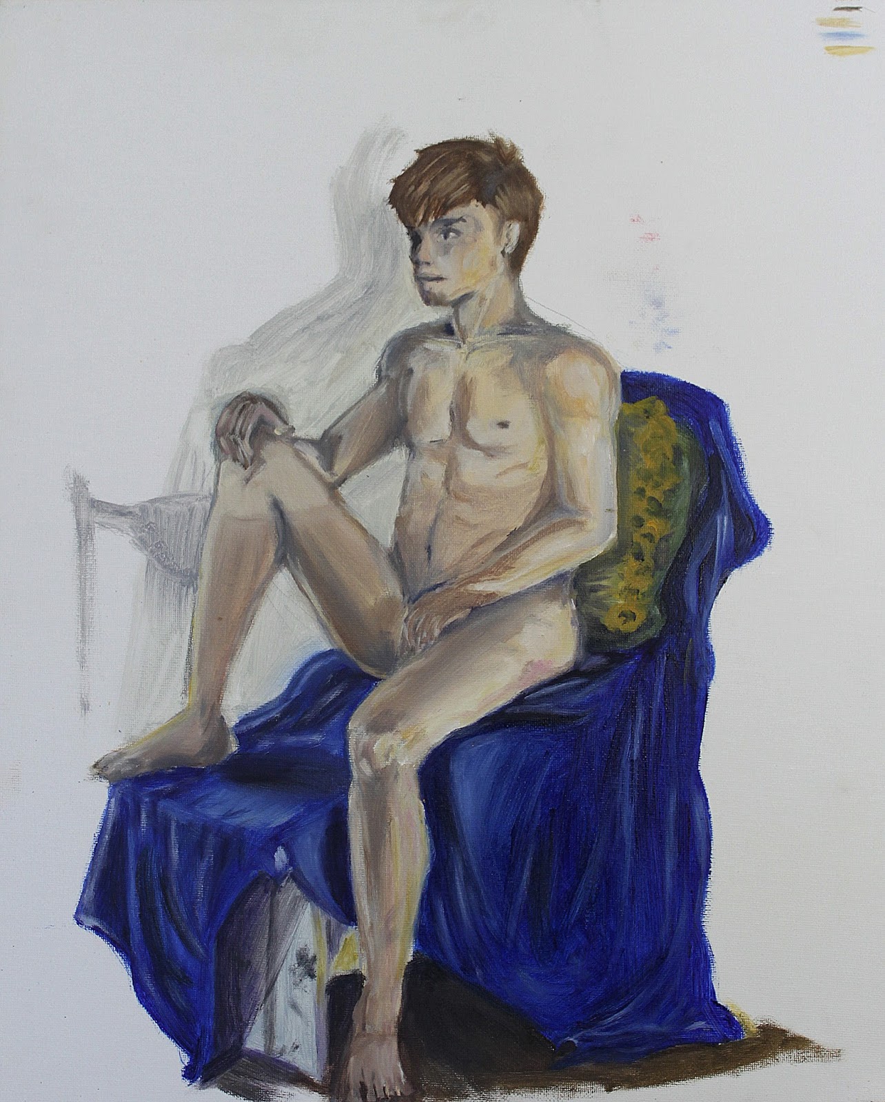
Without that shadow and pillow this piece would feel unfinished. I am glad the background has no wash and is brilliant white.
ReplyDeleteThe defined tones and use of color from the bottom of the frame to the top is very well thought out. My favorite aspect in the piece is the definition of value shifts in his left leg. I actually feel that maybe a light blue wash could be a great compliment to the figure.
ReplyDeleteThe model is well balanced and painted evenly. Aside from what was talked about in class, the only other thing that I saw that wasn't brought up is the registration marks in the upper right hand corner. I know why they are there, but they don't work in this painting. They either need to be given some attention the same way everything else was painted or erased, but they are distracting to the image.
ReplyDeleteone of the few that white background compliments foreground I would push colors in the skin to bring it out even further
ReplyDeleteThe best part of this painting is your elaborately painted blue cloth. If you can carry out that dedication to the cloth to the figure, I think you could have a strong painting. The proportions on the body are good but your face needs some work. Next step for you would be to put in a background. I think that would also elevate your piece.
ReplyDeleteThe figure has a very graphic quality to it that I enjoy looking at. Though the head may be a little big, your proportions overall are very good. This, coupled with the great attention to light and shadow that you display in the figure, the amazing blue fabric, and the horse, really ground the figure on the horse and make the white background feel like a light source. I think a little bit of value variation in the background could help ground the piece overall, and add to the sense of light coming from the left.
ReplyDeleteI think that the blue cloth draped over the edge of the drawing horse, was done really well. I love the small corner of drawing horse that was left visible. The left foot was challenging for me and I think the foreshortening look great on that foot. I remember your still life from drawing one, and they were great, I think it's only a short matter of time before your figure painting skills match your still life's.
ReplyDeleteI agree with Rabia. I kind of feel like the detail and intensity in the blanket take over the painting. The blanket is the first thing I look at. The figure looks great so far but maybe it would benefit from more saturated color so that it doesn't get dominated by the other miscellaneous details. Also, the white background is great, it keeps the painting simple and I like that. Great job!
ReplyDeleteI get somewhat distracted by the small smudges of paint above the figures shoulder as well as the color splotches in the top right corner. I think that the figure would be better served by painting those out as it would not pull the eye away so much. Compositionally I think shifting him to the right would give the painting more room to circulate by allowing his gaze to remain in frame longer. I love the rendering of form in the figure, the blanket, and the corner of the chair. They are all very convincing and play off of each other well. I think the blue might be a little too brilliant, but I would simply add more color to the figure and brighten him up so that they both become more vibrant in the image as a holistic subject.
ReplyDeletethe shape of your figure is composed very well and the flesh tones are very realistic. The only problem is that there is too much flesh tone pigment in your figure and not enough cool and warm tones. too much flesh tones with greys for the dark areas makes a figure have a corpse-like feel to it
ReplyDeleteThe background seems to be the most unsettling for me, but i believe there is genuinely a character captured in this moment. I agree with the choice of composition in the fabric. It brings the scene to life.
ReplyDeleteI really enjoy your angle on the subject. I feel that the tones you chose to use in your palate are working very well together. The thing that I think could use some improvement would be to add maybe more hues of blues and reds into the flesh. The fabric and horse he's sitting on looks awesome!
ReplyDelete